A photography style guide ensures consistency and visual identity across images‚ helping brands convey their message effectively through coherent aesthetics and professional presentation.
Importance of a Consistent Photography Style
A consistent photography style is crucial for building brand recognition and creating a cohesive visual identity. It ensures that all images‚ whether for marketing‚ social media‚ or storytelling‚ align with the brand’s message and aesthetic. Consistency in color palette‚ lighting‚ and composition helps establish professionalism and reliability. By maintaining a uniform look‚ brands can evoke specific emotions and convey their values more effectively. A well-defined style also streamlines the creative process‚ ensuring that every photo contributes to the brand’s overarching narrative. Ultimately‚ consistency fosters trust and makes a brand’s imagery instantly recognizable‚ enhancing its appeal and impact in a competitive market.
Color Palette and Saturation
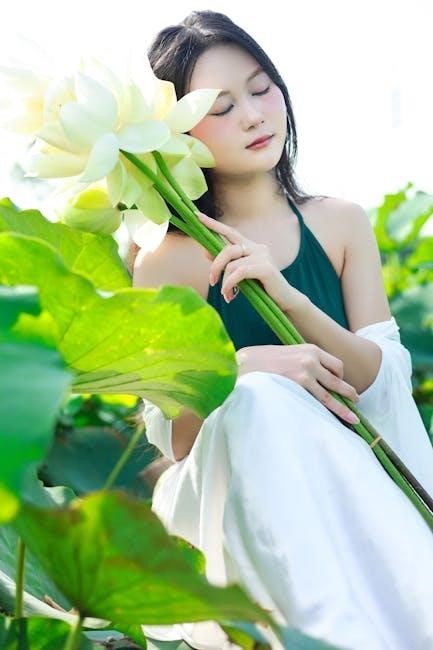
Defining a color palette ensures brand consistency‚ while balanced saturation enhances visual appeal. Soft pastels and neutrals are recommended to avoid overwhelming images‚ maintaining a professional look.
Choosing a Brand-Appropriate Color Scheme
Selecting a color scheme tailored to your brand ensures visual coherence and emotional resonance. Start by identifying your brand’s core identity and values‚ then choose colors that reflect them. Soft pastels and neutrals are ideal for minimizing distractions‚ while muted tones align well with professional aesthetics. Avoid bold‚ clashing colors that may overwhelm the subject or deviate from your brand’s message. Opt for complementary hues that enhance harmony and balance. Consider warm‚ earthy tones for a natural feel or vibrant shades for a dynamic impact. Ensure consistency by limiting the palette to 2-3 primary colors and using them across all images. This approach creates a unified visual language that strengthens brand recognition and storytelling.
Understanding Saturation Levels for Visual Appeal
Saturation levels play a crucial role in enhancing the visual appeal of images. Over-saturation can make photos look unnatural‚ while under-saturation may result in dull‚ lifeless visuals. Aim for a balance that complements your brand’s aesthetic‚ ensuring colors are vibrant yet realistic. Soft pastels and neutrals are ideal for creating a clean‚ professional look‚ while muted tones can evoke a timeless‚ sophisticated feel. Avoid overly bright colors that distract from the subject. Instead‚ opt for subtle saturation adjustments that enhance the mood and atmosphere of the image. Consistent saturation levels across all photos ensure a cohesive brand identity and professional presentation. This balance is key to creating visually appealing and engaging imagery.
Lighting in Photography
Lighting is essential for creating mood and depth in images. Use natural light whenever possible‚ and mimic it with artificial sources for consistency. Avoid harsh shadows and ensure balanced illumination to enhance visual appeal and maintain a professional look across all photos.

Utilizing Natural Light Effectively
Natural light is a cornerstone of professional photography. Opt for soft‚ diffused light during the golden hour or overcast days to minimize harsh shadows. Avoid midday sun‚ as it creates unflattering highlights. Position subjects near windows or outdoors during early morning or late afternoon for even illumination. Reflectors can soften direct sunlight‚ reducing strong contrasts. For portraits‚ place subjects with their faces slightly angled away from the sun to avoid squinting. This approach ensures consistent‚ flattering results across all images‚ enhancing your brand’s visual identity and maintaining a cohesive style in photography.
Artificial Lighting Techniques for Consistency
Artificial lighting is crucial for maintaining consistency in brand photography when natural light isn’t available. Use softbox lights or ring lights to create even‚ diffused illumination that mimics natural light. Ensure consistent lighting setups across all shoots to maintain a uniform brand image. Balance highlights and shadows to add depth and dimension‚ enhancing visual appeal. Employ reflectors or diffusers to soften harsh light and reduce unwanted shadows. White balance is essential for accurate color representation‚ ensuring the color palette remains consistent. Proper positioning of lights directs attention to key elements‚ reinforcing the brand’s storytelling. These techniques ensure polished‚ professional images that align with the brand’s visual identity effectively.
Composition and Aesthetics
Composition and aesthetics in photography involve arranging elements like lines‚ shapes‚ and textures to create balanced‚ visually appealing images that reflect the brand’s identity consistently and harmoniously.
The Rule of Thirds for Balanced Frames
The rule of thirds is a fundamental composition technique that divides the frame into thirds both horizontally and vertically‚ creating nine equal parts. By placing key elements along these lines or at their intersections‚ images become more balanced and visually engaging. This method avoids the static feel of centering the subject‚ instead creating dynamic and harmonious compositions. It also guides the viewer’s eye naturally through the scene. For portraits‚ placing eyes or faces at intersection points enhances focus and storytelling. Landscapes benefit by positioning horizons or leading lines along the thirds. Consistently applying this rule ensures cohesive and professional-looking photographs that align with the brand’s aesthetic goals.
Leading Lines and Symmetry in Photography
Leading lines and symmetry are powerful tools for creating visually appealing and structured compositions. Leading lines guide the viewer’s eye through the image‚ often to the subject‚ using elements like roads‚ shorelines‚ or patterns. Symmetry adds balance by mirroring elements within the frame‚ such as reflections or architectural features. Both techniques enhance depth and order‚ making images more engaging. Symmetry can create a sense of calm‚ while leading lines add dynamism. When applied thoughtfully‚ these elements strengthen the overall aesthetic and ensure consistency in a brand’s photography style. They help direct attention‚ evoke emotions‚ and create a professional‚ polished look that aligns with the brand’s visual identity and messaging goals.
Focal Length and Depth of Field
Focal length and depth of field are crucial for controlling perspective and focus in images‚ enabling photographers to emphasize subjects and create visually engaging‚ professional compositions.
Selecting the Right Focal Length for the Scene
Selecting the right focal length is essential for capturing the desired perspective and emphasis in an image. A shorter focal length‚ such as 10-24mm‚ is ideal for wide-angle shots‚ perfect for landscapes or interiors‚ as it captures more of the scene and creates a sense of space. Medium focal lengths‚ like 24-70mm‚ are versatile for everyday photography‚ offering a natural perspective similar to the human eye. Longer focal lengths‚ such as 70-200mm or more‚ are great for portraits‚ compressing the scene and blurring backgrounds to highlight subjects. Choosing the right focal length ensures consistency with your brand’s visual identity and enhances storytelling in your photography.
Managing Depth of Field for Focus Control
Depth of field is a critical element in photography‚ controlling what is in focus and what is blurred. A wide aperture (low f-stop) creates a shallow depth of field‚ blurring backgrounds and emphasizing subjects‚ ideal for portraits. A narrow aperture (high f-stop) keeps more of the image sharp‚ suitable for landscapes or product photography. Properly managing depth of field ensures your subject stands out while maintaining visual harmony. Consistency in depth of field across images aligns with your brand’s aesthetic‚ creating a cohesive visual narrative. Experiment with aperture settings to achieve the desired focus effect‚ ensuring your photography style remains uniform and impactful.
Shadows and Highlights
Shadows and highlights are fundamental for creating mood and depth. Balancing them enhances visual storytelling‚ ensuring images evoke the desired emotional response while maintaining brand consistency.
Balancing Shadows and Highlights for Mood
Shadows and highlights are essential for creating depth and mood in photography. Balancing them ensures that images convey the desired emotional tone while maintaining visual harmony; Properly managed shadows add mystery and dimension‚ while highlights draw attention to key elements. Overexposed highlights can wash out details‚ while underexposed shadows may lose texture. The goal is to strike a balance that enhances storytelling without sacrificing clarity. Techniques like adjusting exposure‚ using reflectors‚ or employing post-processing tools can help achieve this equilibrium. By controlling shadows and highlights‚ photographers can guide the viewer’s eye and evoke the intended atmosphere‚ ensuring consistency with the brand’s visual identity.
Consistency in Brand Photography
Consistency in brand photography ensures a uniform visual identity‚ reinforcing brand recognition and professional presentation across all platforms‚ while maintaining emotional and aesthetic continuity.
Maintaining Uniformity Across All Images
Maintaining uniformity across all images ensures a cohesive brand identity by aligning color schemes‚ lighting‚ and composition. This consistency helps in creating a recognizable visual language‚ making the brand instantly identifiable. Uniformity also enhances professionalism and trust‚ as it reflects a polished and intentional approach. To achieve this‚ brands should establish clear guidelines for photographers and editors‚ including specific color palettes‚ lighting setups‚ and framing styles. Regular audits of images and feedback to contributors can help uphold these standards. Additionally‚ using consistent editing software and techniques ensures that the final output aligns with the brand’s aesthetic vision‚ creating a seamless visual experience across all platforms.
Styling Tips for Subjects
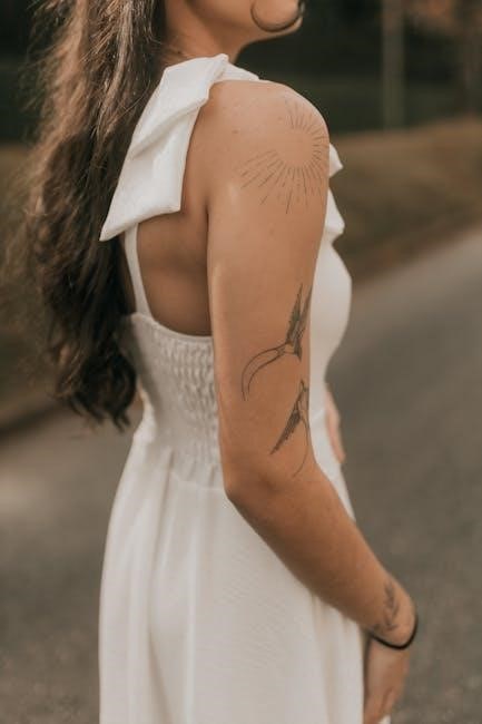
Opt for soft‚ neutral tones and muted shades to ensure subjects stand out naturally. Avoid bold patterns and bright colors to maintain focus on the subject‚ ensuring a cohesive brand image across all photography.
Clothing and Accessory Recommendations
When preparing for a photoshoot‚ choose clothing that complements the brand’s visual identity and the session’s environment. Opt for soft‚ neutral tones and muted shades to avoid overwhelming the subject or clashing with the backdrop. Patterns should be subtle or avoided altogether to prevent visual distractions. Accessories should enhance the overall aesthetic without overpowering the scene. Ensure fabrics are comfortable and allow for natural movement‚ as stiff or overly tight clothing can appear unflattering on camera. Avoid bold or bright colors that might steal focus from the subject. Instead‚ select hues that align with the brand’s color palette for a cohesive and polished look. This approach ensures consistency and professionalism across all images.
Prop Styling for Enhanced Storytelling
Prop styling is a powerful tool to enhance the narrative and emotional depth of your photographs. Thoughtfully selected props can convey the brand’s message‚ evoke a specific mood‚ or highlight a theme. Choose props that align with the brand’s aesthetic and the scene’s context‚ ensuring they complement the subject without overpowering it. Consider textures‚ colors‚ and objects that resonate with the brand’s identity. For example‚ vintage items‚ seasonal elements‚ or thematic accessories can add layers to the story. Avoid clutter; instead‚ use props sparingly to create a cohesive and intentional visual language. This approach ensures the image tells a compelling story while maintaining focus on the subject‚ ultimately reinforcing the brand’s visual identity and messaging.